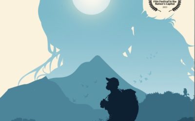
disciples in the moonlight

Feature film
Role: Colorist
Synopsis:
A reluctant leader heads up a team of seven Christians intent on smuggling Bibles to underground churches in a future America where the Bible is illegal and danger is around every corner.
———
Watch the trailer below and keep scrolling for the case study!
Film: @disciplesinthemoonlight
Director: Brett Varvel / @brettvarvel
Writer: @joshstryke
1st AD: @kari.fabian
DP: JJ Bukowski / @desert.dp
Gaffer: @lee337photo
Grip: @ethan_curtis_film
1st AC: @stephenmhiggs
Production Design: @thegaryvarvel
Makeup: @merryewise
Sound: Nathan Ashton
Music: @zachary_horner
Colorist: John-Clay Burnett – @johnclay.burnett
Release: Fathom Theatrical
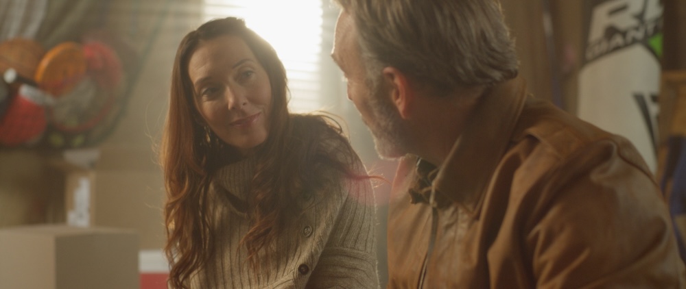
“Disciples in the Moonlight” looks amazing! The nuances that pop off the screen from his work are extraordinary. I’m so pleased and so excited for people to witness all the work he put into this.

Watch the Trailer
CASE STUDY
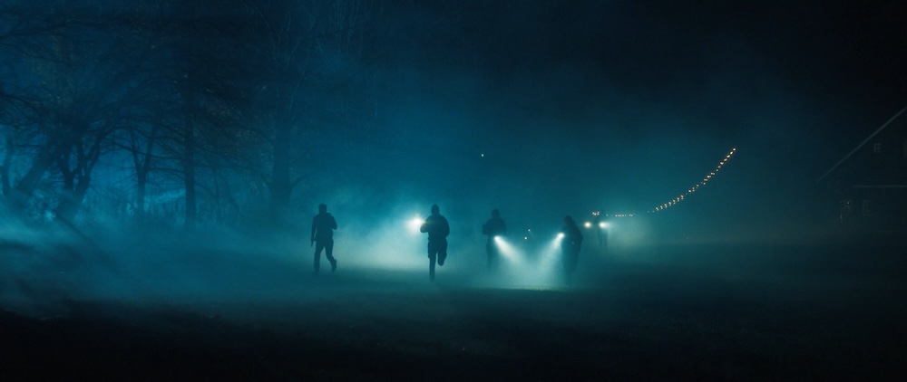
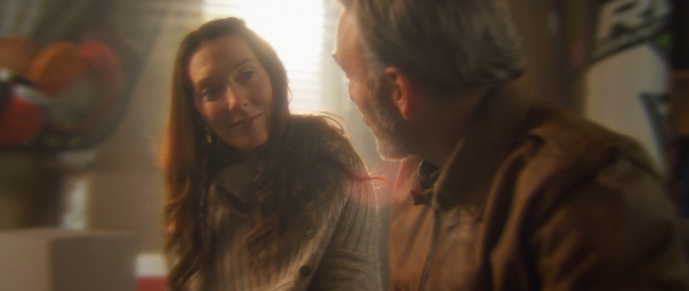
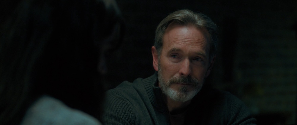
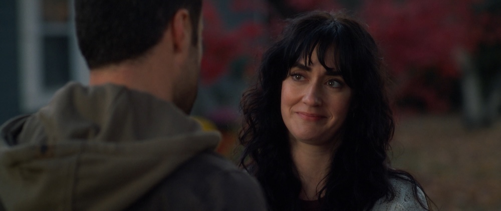
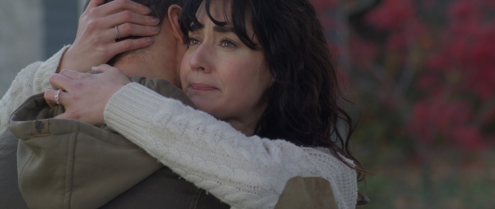
I was excited to work on “Disciples in the Moonlight” ever since the director reached out over 7 years prior, (It spent a long time in development). The story itself, set in a dystopian future, was perfect for exploring a cinematic look that was darker than most projects I had worked on.

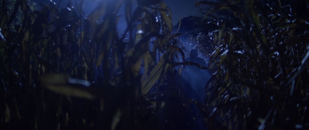
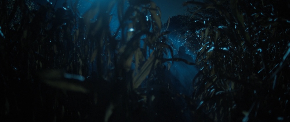
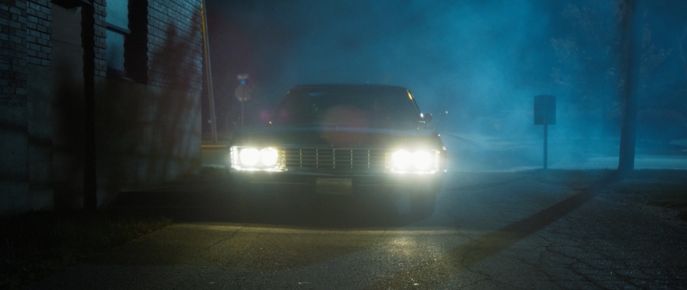
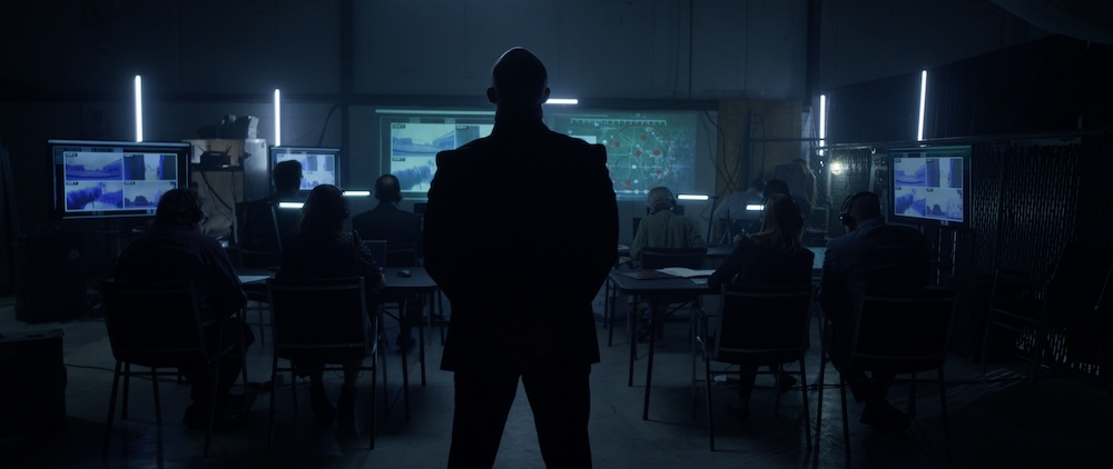
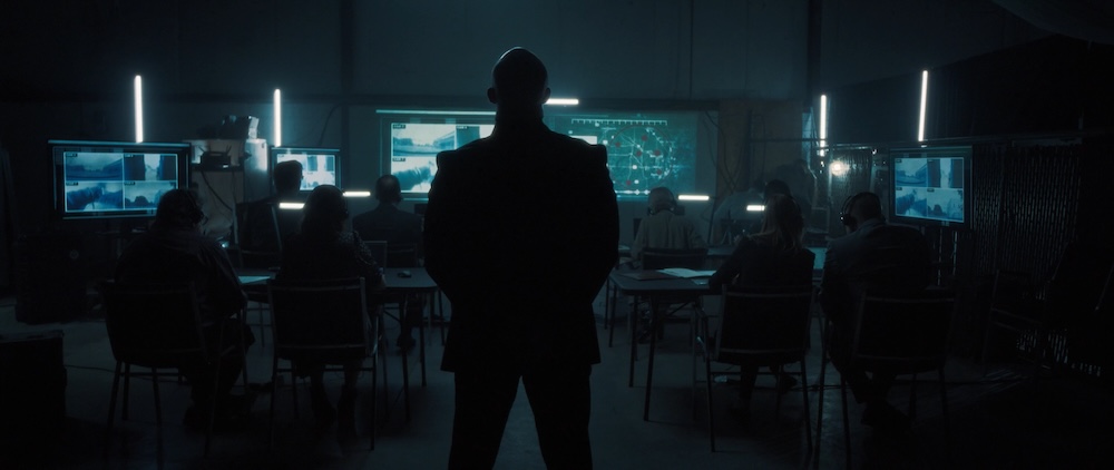
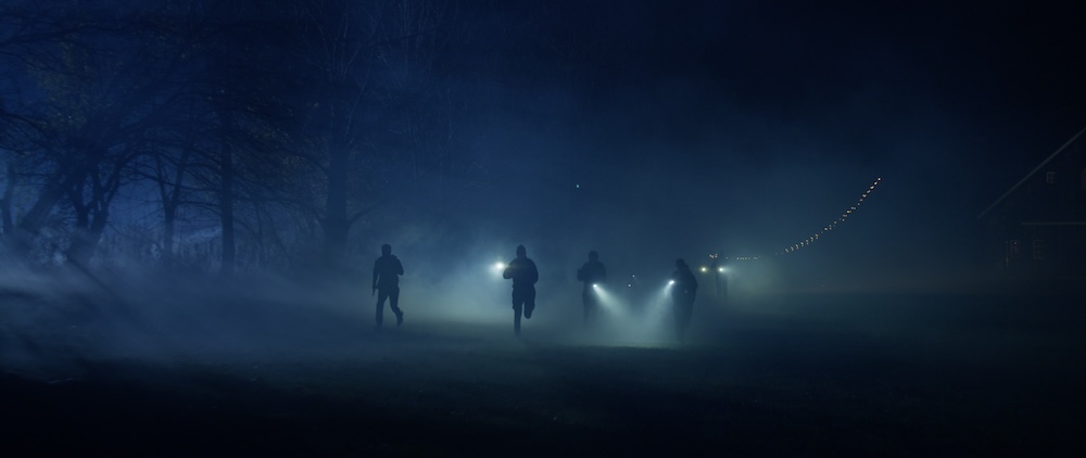
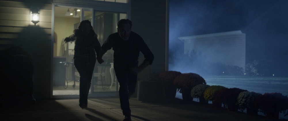
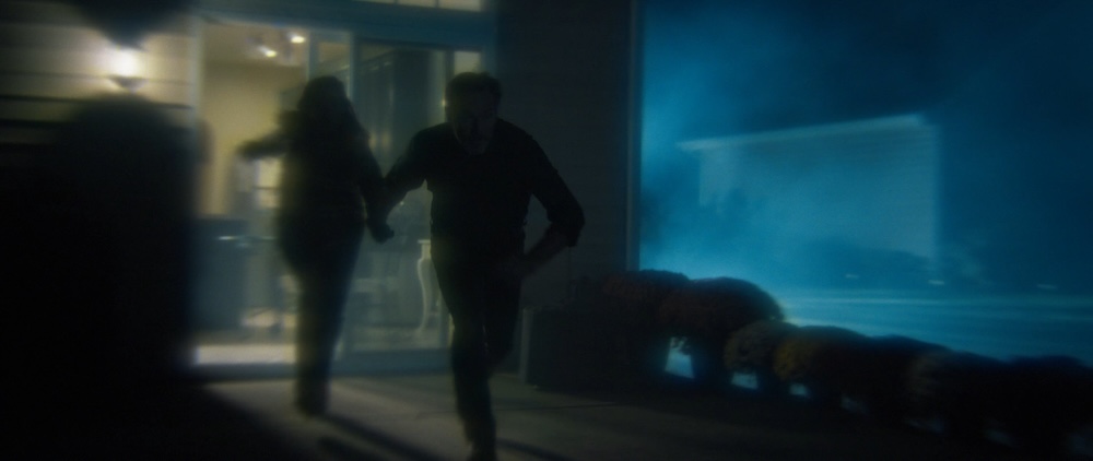
One of the first tasks was to develop a very specific shade of teal blue for the film, something that conveyed that cold, oppressive atmosphere of “the bad guys” and also was a consistent “moonlight” throughout.
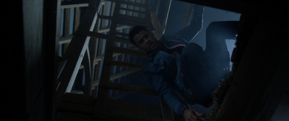
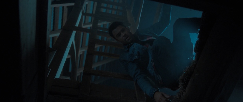
We used this image from the opening barn scene as our moonlight reference for the rest of the film.

It took a while to land on the exact shade of teal, especially since the footage from the cameras had a bit of a magenta cast to it. I had to correct that and work closely with the director and DP to make sure the blues felt eerie, but still believable in the world we were creating.
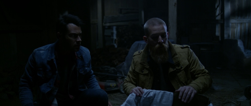
For the interior of the barn, we reduced the contrast and muted any bright highlights to create a softer ambient moonlight feel.
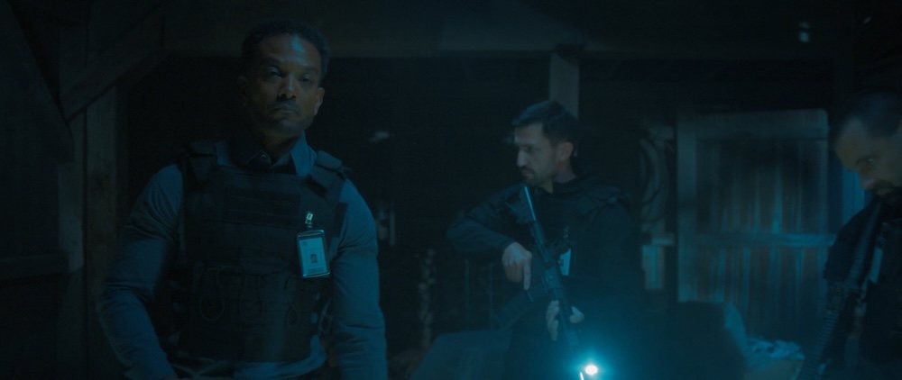

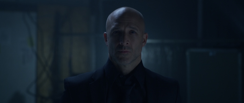
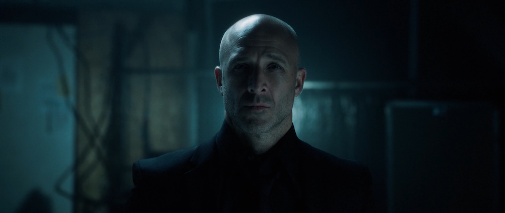
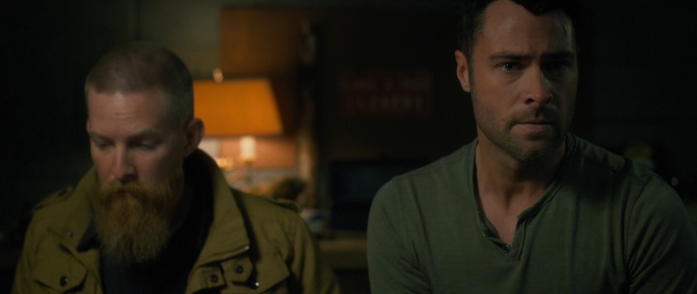
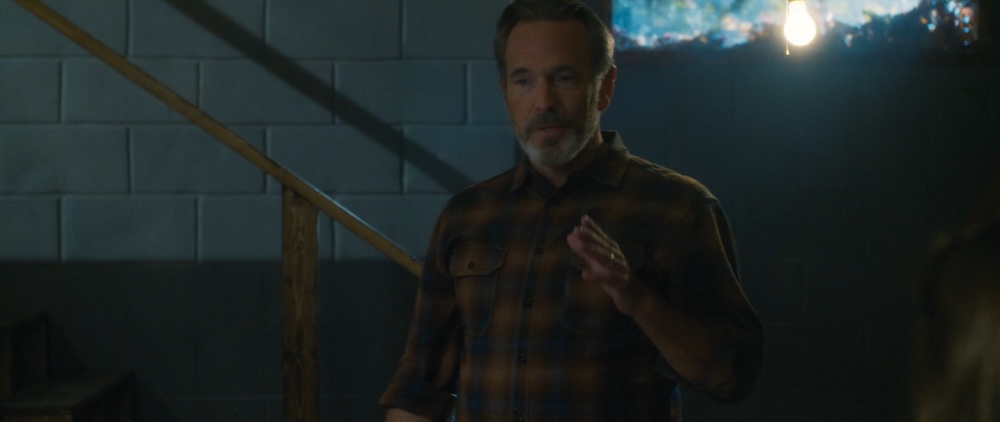
For the villian’s “evil lair” we leaned into the higher contrast look with more greens in the shadows and the least amount of warmth in the skin tones.
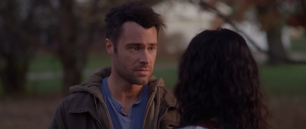
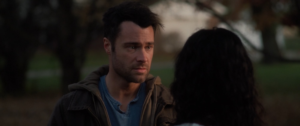
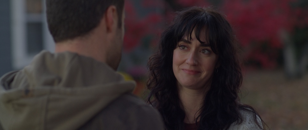
We also developed looks for several other key scenes that were brighter or warmer than the primary moonlit tones.
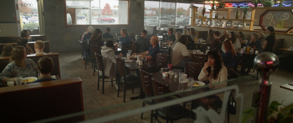
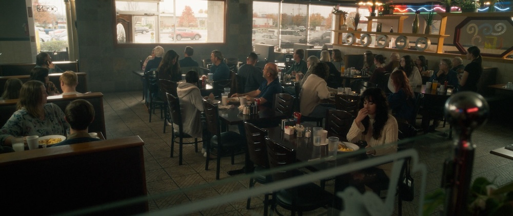


There are a couple of daytime interior scenes where sunlight is coming through the windows, which isn’t something we saw often throughout the film. I worked to make sure that the warmth of the sunlight didn’t overwhelm the coolness of the shadows.

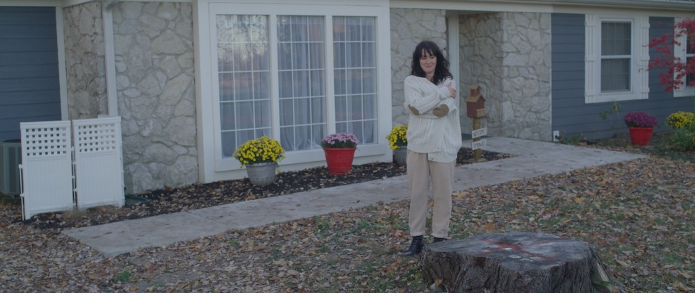
Daytime exteriors also needed to have cool feeling shadows, but we were ok with the sunlight being warmer as a juxtaposition to the teal moonlight. (these examples are not from the same scene)
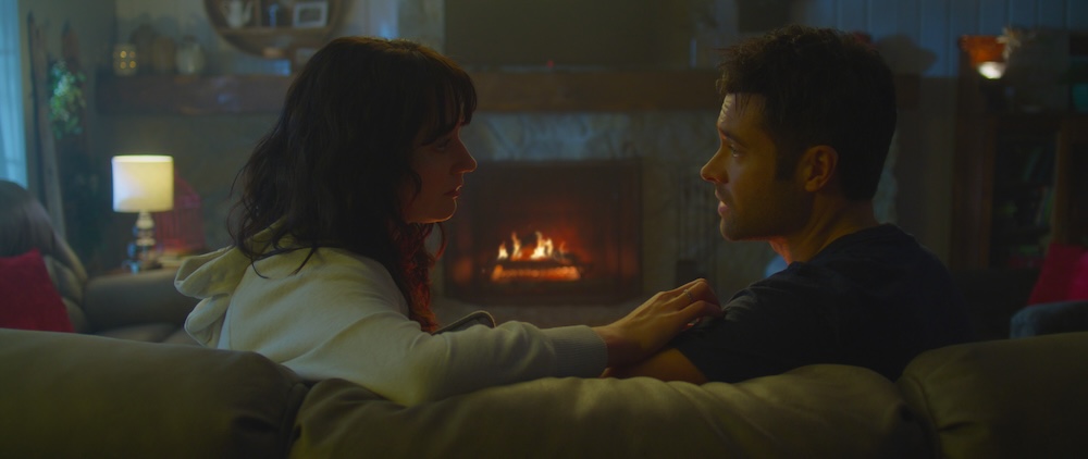
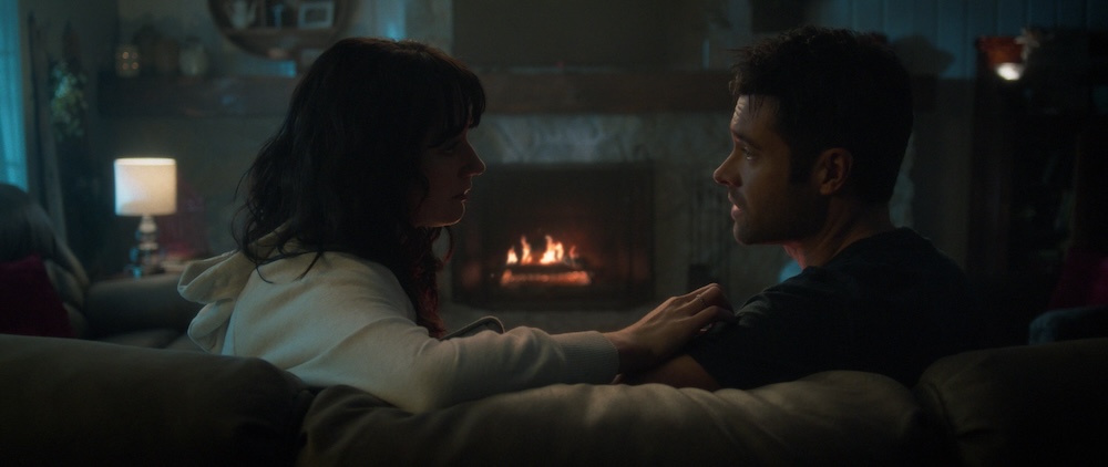
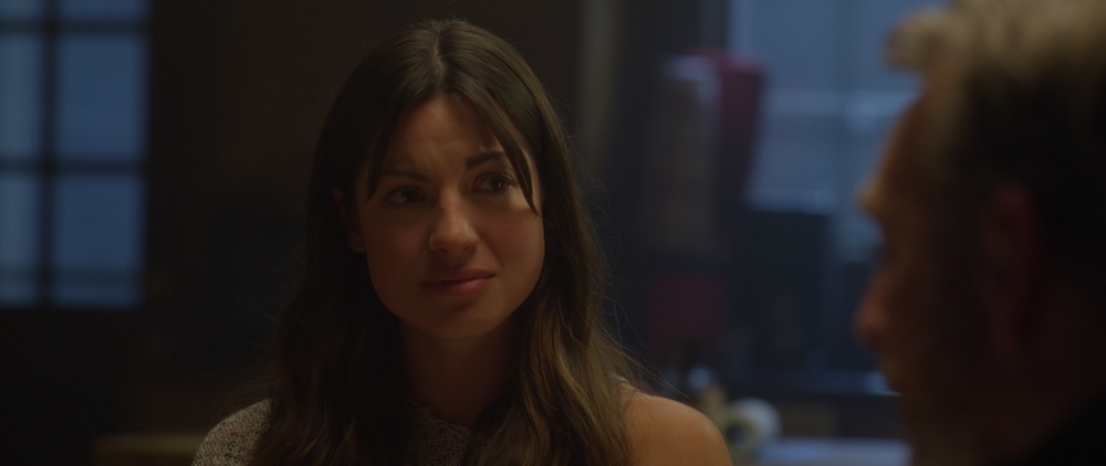
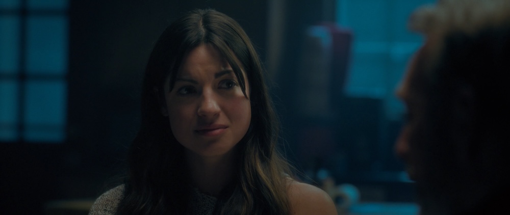
BEFORE

AFTER

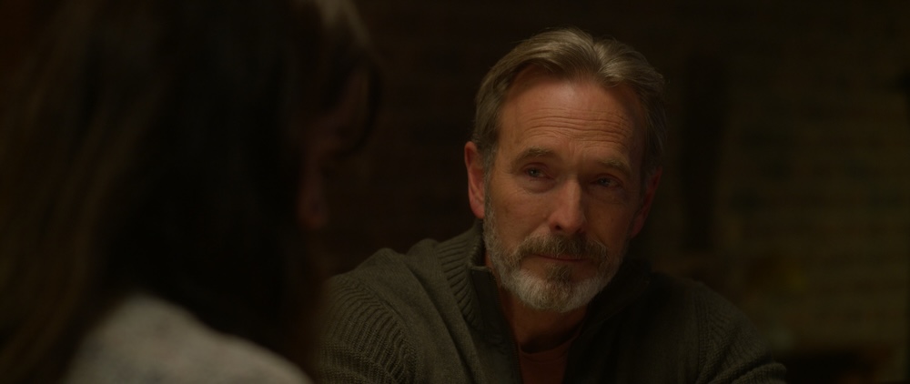
BEFORE

AFTER

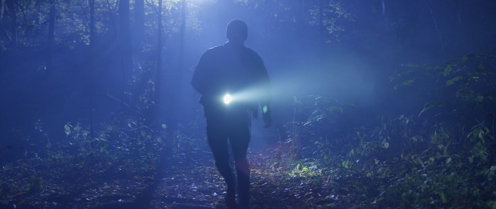
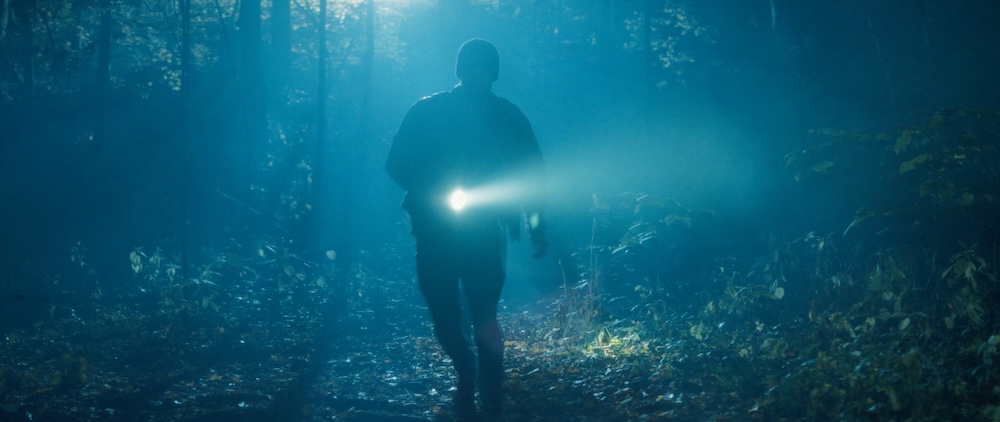
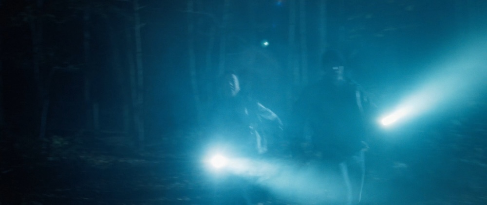
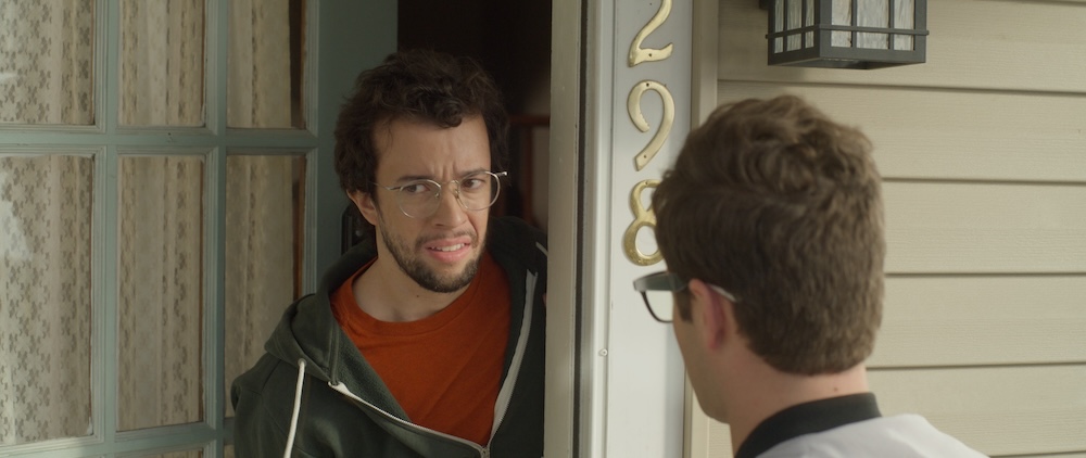
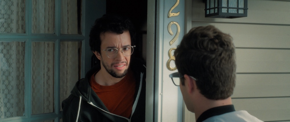
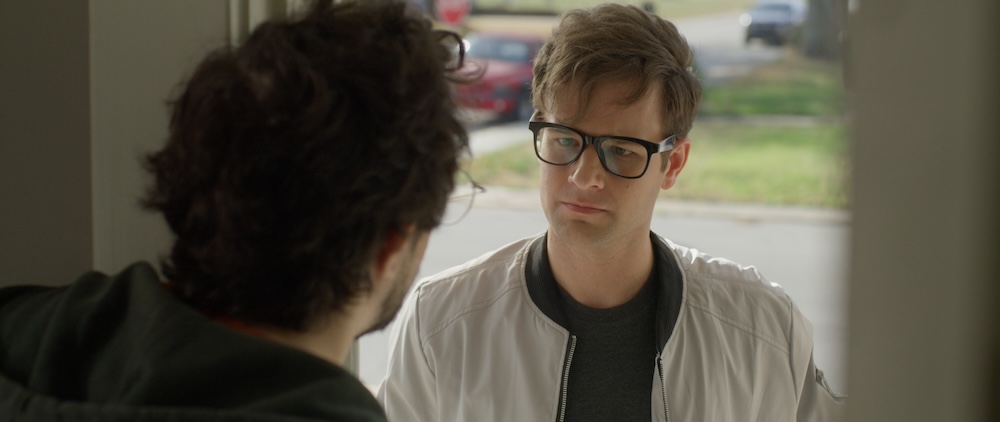
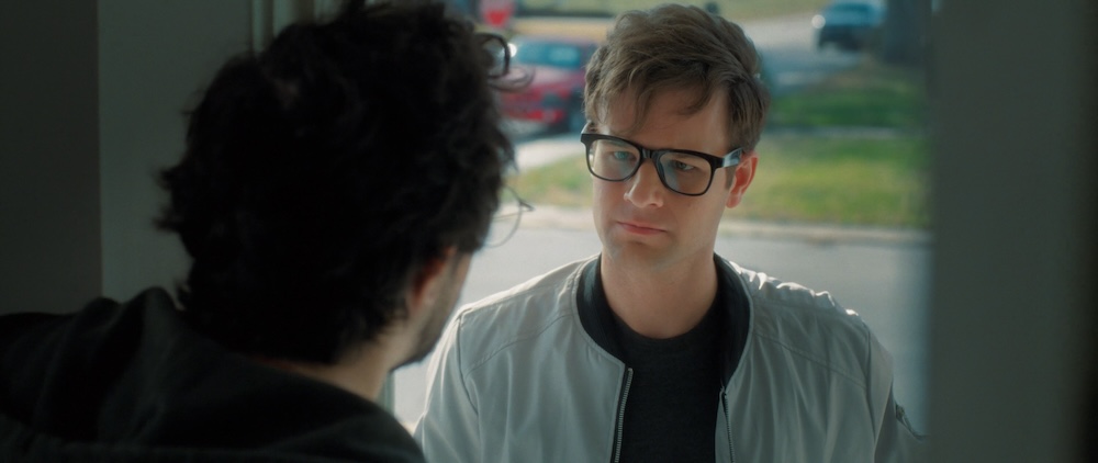
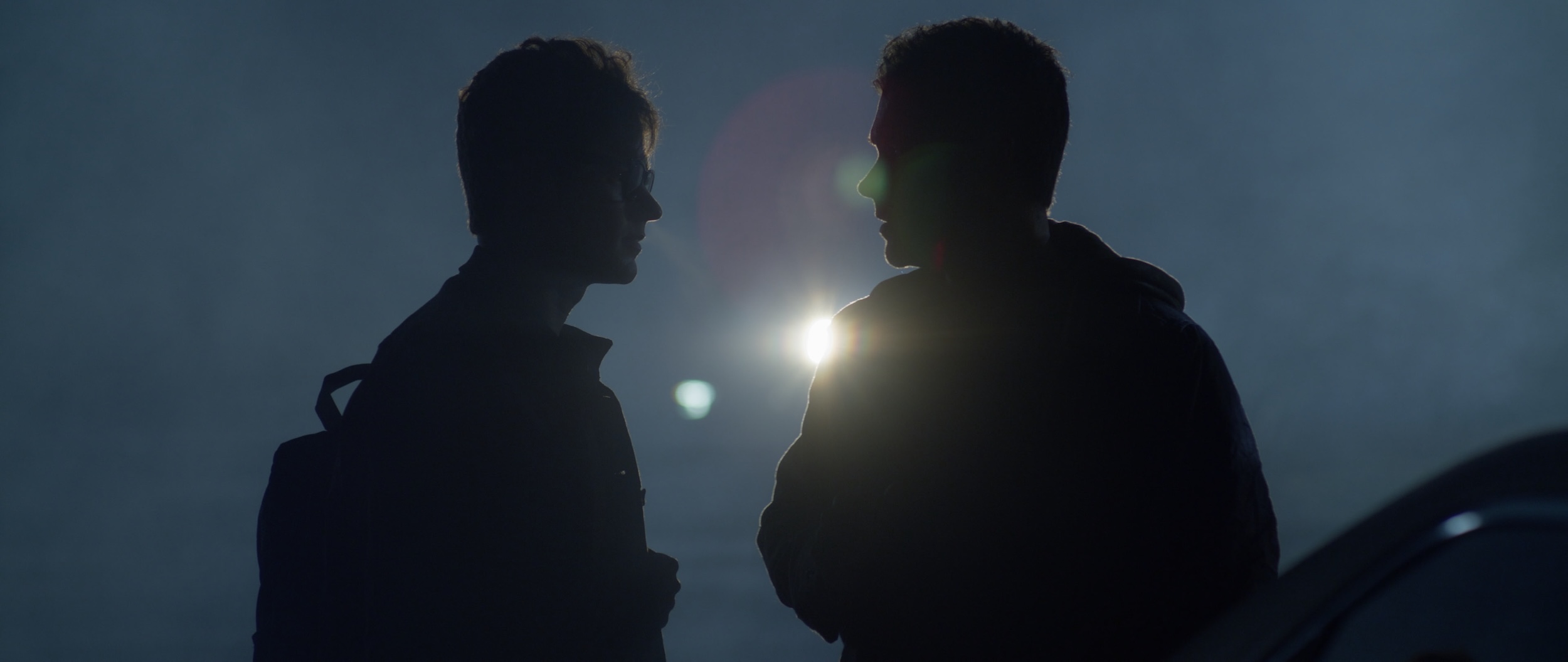
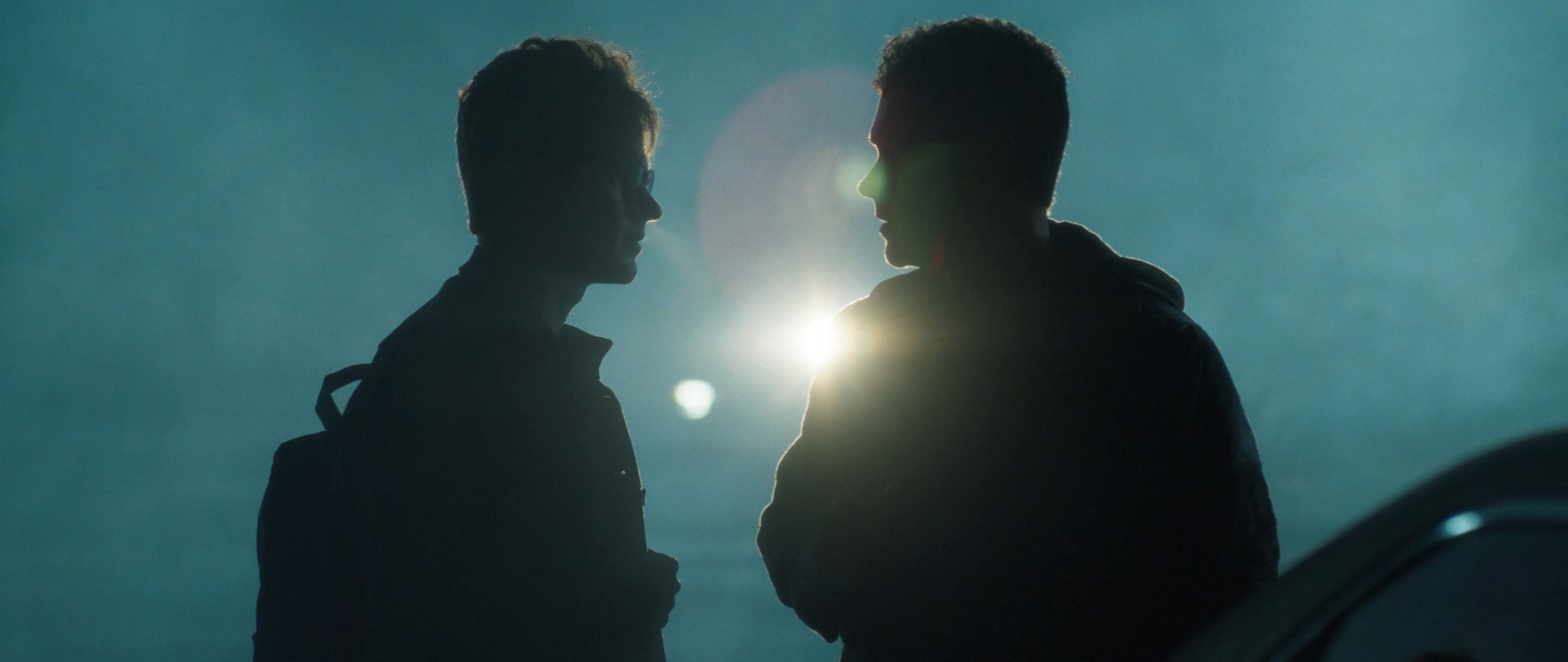
One of the key parts of the process was working on the scenes with flashlights. The challenge here was that the LED flashlights cast an unnatural greenish hue.
I needed to isolate the areas affected by the flashlight beams, especially when the light would fall across a character’s face. I then tracked those areas throughout the shot and removed the harsh green tint to bring the lighting back to the cooler blue tones we’d established.


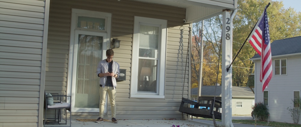
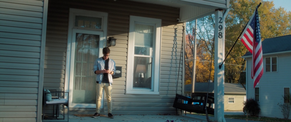
Or using power windows to shape the exterior light on a porch scene.
For this flashback sequence I got to play around with blurs, edge distortion, and RGB splitting.
To match this scene together the led lights on the stage need to be adjusted in brightness and the color hues brought in light with the palette of the film, and the congregation needed to be brightened.
BEFORE

AFTER

BEFORE

AFTER

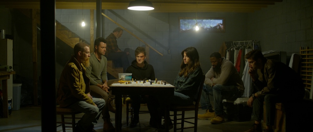
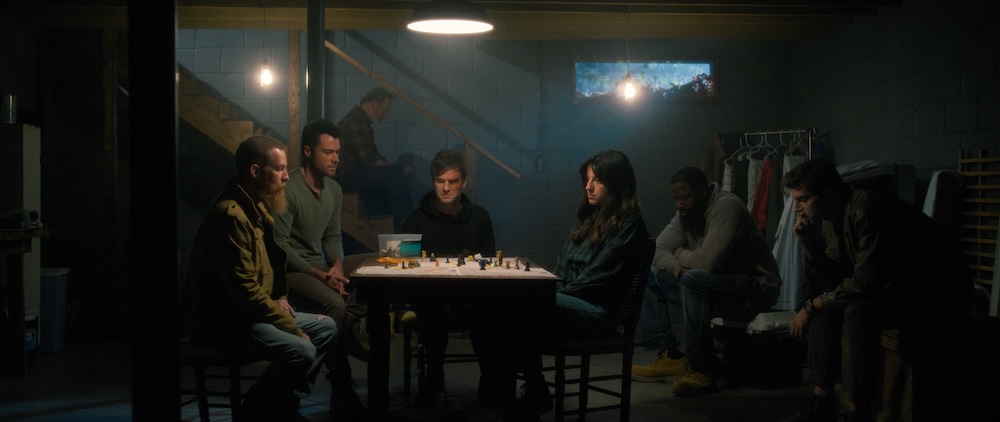
Matching together a scene in the basement. Several different angles…with haze that invariably was at variable levels in each.

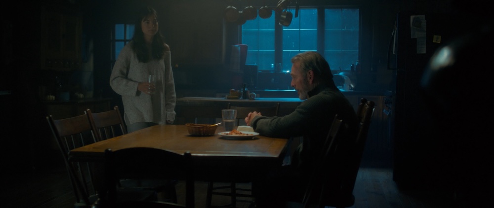
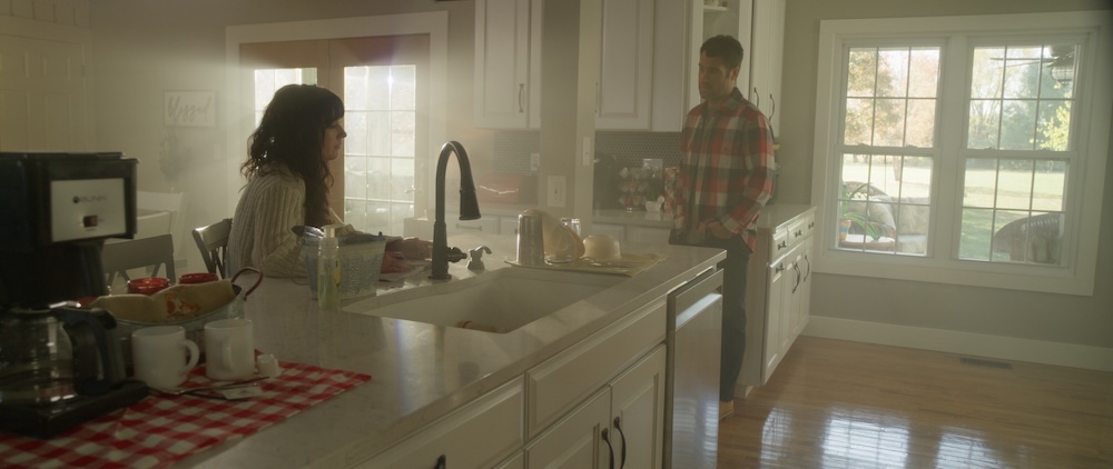
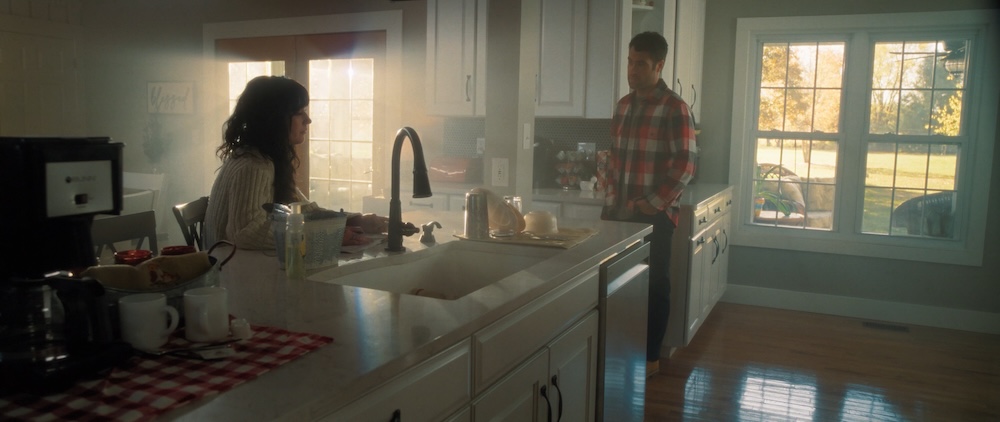
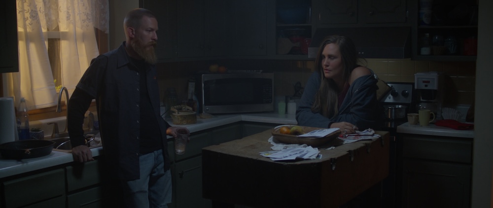
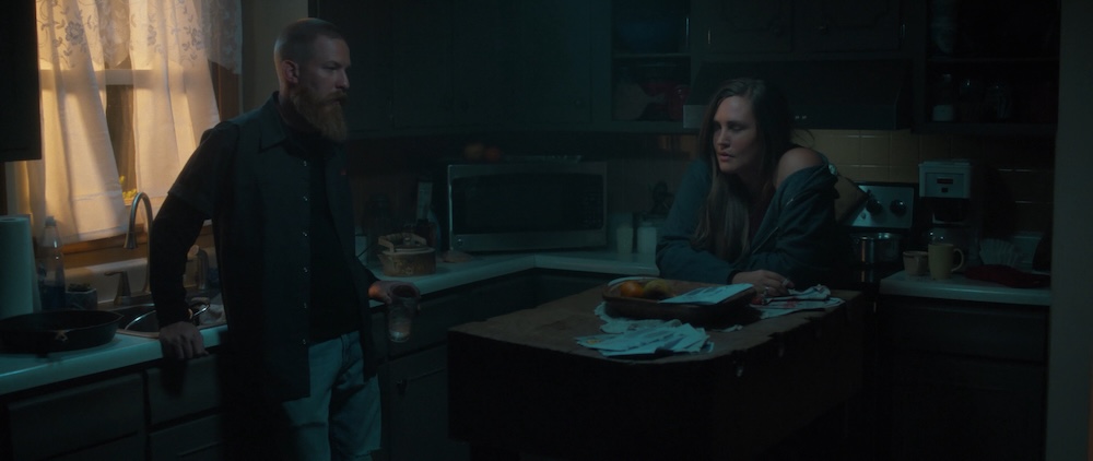
Matching together a scene at a kitchen table making sure the moonlight through the window matches, and that the table in the wide isn’t too saturated.
Matching together an exterior scene that was filmed as the sun was setting. It does make for some beautiful light to work with…except on the shots filmed before the sun was setting. Boy howdy this one took some work!
The final touch was adding film grain. We used the Film Box plugin (from Video Village) to give the footage a bit of texture, which helped soften some of the sharper digital edges and made everything feel more grounded.
We also used the Scatter plugin (also from Video Village) to give the highlights a soft glow.
These small effects added that extra bit of polish to the film, helping it feel cinematic and immersive.
For the majority of the project we all worked remotely and had periodic virtual review sessions. But for the final pass the DP and Director came out and we worked in person…at my make-shift setup because we were in the process of moving and my new office wasn’t quite ready yet. 🙂


My wife and I enjoyed being able to attend the red carpet premiere for the film!


You can see more color breakdowns by watching the full color behind-the-scenes.
THANKS FOR READING!
STILL IMAGES


more about editing
POST PRODUCTION

More about COLOR
Riverside
Documentary Role: Colorist Synopsis:Riverside County, created in 1893 from portions of San Bernardino and San Diego counties, is the fourth largest in the state of California covering over 7,300 square miles. The law enforcement professionals of the Riverside...
Heart of Maui
Documentary Role: Colorist Synopsis:This short National Park Service documentary film follows two biologists working to save rare and endemic forest birds in Haleakalā National Park. From the mauka (mountains) to makai (sea), beautiful forest birds once cover...